Your supplier diversity number is right. It is also useless.
Every organisation that has ever run a supplier diversity programme knows its aggregate number. Or thinks it does. The percentage of spend that reached women-owned suppliers last year. The share of the supplier base that is youth-owned. These numbers are quoted in board presentations, included in ESG disclosures, and repeated


Every organisation that has ever run a supplier diversity programme knows its aggregate number. Or thinks it does. The percentage of spend that reached women-owned suppliers last year. The share of the supplier base that is youth-owned. These numbers are quoted in board presentations, included in ESG disclosures, and repeated in conversations with donors and development finance partners.
What almost none of them know is where that number comes from. And more specifically: which categories it comes from, and which ones it does not.
That gap turns out to matter more than the aggregate.
When Scale runs a supplier prequalification, nobody briefs us on inclusion targets. We are asked to run a rigorous exercise, which we do. Because supplier ownership type is a required field in Scale’s onboarding, the inclusion data comes out as part of the standard output – whether or not anyone asked for it.
What consistently surprises procurement teams is not the aggregate. It is the map.
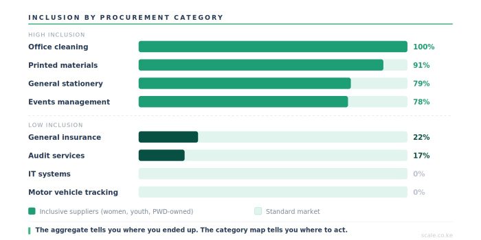
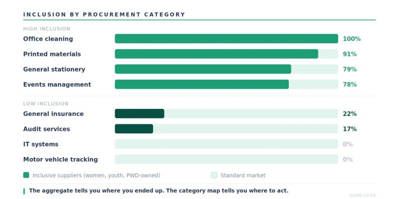
Here is what the data looks like at category level, drawn from prequalification exercises across Scale’s client base.
- Office cleaning and fumigation: 100% of prequalified suppliers from preferential ownership groups. Women-owned, youth-owned, or both. Not a single standard-ownership business in the panel.
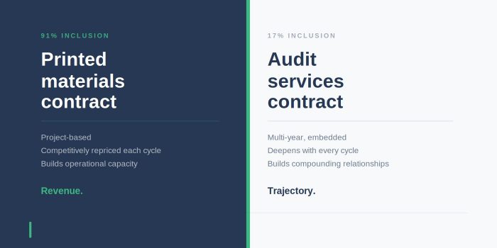
- Printed materials: 91% inclusive.
- General stationery: 79%.
- Events management: 78%.
Then the map flips.
- Audit services: 17% inclusive.
- General insurance: 22%.
- Motor vehicle tracking: 0%.
- Information technology and systems: 0%.
The two sides of that map describe completely different economies. The first set – cleaning, printing, stationery, events – are categories where women-owned and youth-owned businesses have built genuine market presence. They are there. They are competitive. They are winning work. The second set – audit, insurance, tracking, technology – are categories still dominated by businesses large enough to have never been asked the question in the first place.
Here is what this does to the aggregate.
An organisation that runs most of its procurement spend through facilities management, cleaning, and events will show a high women-owned percentage even without any deliberate inclusion policy. The number flatters. An organisation that runs most of its spend through professional services, insurance, and technology will show a low percentage even if its procurement team genuinely wants to do better. The number misleads.
In both cases, the aggregate tells you almost nothing actionable. It tells you what you achieved. It does not tell you whether you could have achieved more, or where.
The category map tells you that. It shows you that cleaning is already there – you do not need to invest effort in opening that category to inclusive suppliers because they are already the majority. And it shows you that audit is not there – not because there are no women-owned or youth-owned audit firms in Kenya, but because the prequalification criteria, the panel structure, and the buyer relationships in that category have not yet been designed to find them.
That distinction is the difference between a supplier diversity programme that is genuinely strategic and one that is incidentally reporting a number.
The category map also surfaces something more uncomfortable.
Some of the most striking findings come from categories that carry significant procurement weight – high value, long-term supplier relationships, meaningful operational influence. These are often the categories where inclusion is lowest. Not because there are no inclusive businesses capable of operating there, but because the panel structure, the prequalification criteria, and the buyer relationships in those categories have not been designed to find them.
When a procurement team sees a zero against a category like this for the first time, the response is rarely defensive. It is almost always the same question: what do we do about this?
That is the question the category map exists to answer. Not the aggregate, which tells you where you ended up. The category map tells you where the gap is and where to act.
Scale produces this data automatically, for every prequalification and every RFx cycle that runs through the platform. Not as a separate report, not as a manual exercise, not as an annual survey. As a by-product of procurement activity.
The buyer sees, per category:
The total number of suppliers in the panel and their ownership breakdown. The invitation rate for inclusive suppliers and the response rate. The win rate – how many inclusive suppliers were invited versus how many were awarded. And the trend: is the inclusion rate in this category going up or down quarter on quarter?
That last piece is the one that changes behaviour. A category manager who knows their audit panel is at 17% and can see it has not moved in three quarters now has a management problem, not just a statistic. The data creates accountability that the aggregate never could.
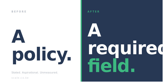
A blunt instrument – not useful as an operational tool.
The AGPO 30% target applies to public procurement. It does not apply to the private sector and it does not operate at category level. It is a blunt instrument – useful as a policy benchmark, not useful as an operational tool.
What Scale’s category data creates is a private-sector equivalent that is more granular, more honest, and more actionable than anything the public sector mandate has produced. Not because the target is wrong but because a target without a category map is a number without a map. You can hit 30% in aggregate while having entire categories in your supply base that inclusive businesses cannot access, and you would never know.
Across Scale’s prequalification data, the combined inclusion rate sits above 54% – more than half of all prequalified suppliers from preferential ownership groups. That number includes the cleaning panels where inclusive businesses are dominant. It also includes the technology and insurance panels where they are absent. The aggregate flatters the second set by including the first.
The category map is honest about both.
One thing we now do consistently when presenting a prequalification report: we show the category map first, before the aggregate. Not because the aggregate is unimportant, but because the category map is what procurement teams actually use. The aggregate goes in the board pack. The category map tells you what to do in Q2.
If you want to know what your own category map looks like, the Supplier Inclusion Assessment will give you a sense of where you stand across four dimensions. It takes eight minutes. What it shows is often different from what organisations assume.